
Building trust
Groundbreaking full-featured currency app that led the way in the online currency market. Key to its success in building trust across our customer base is its strong and simple design.
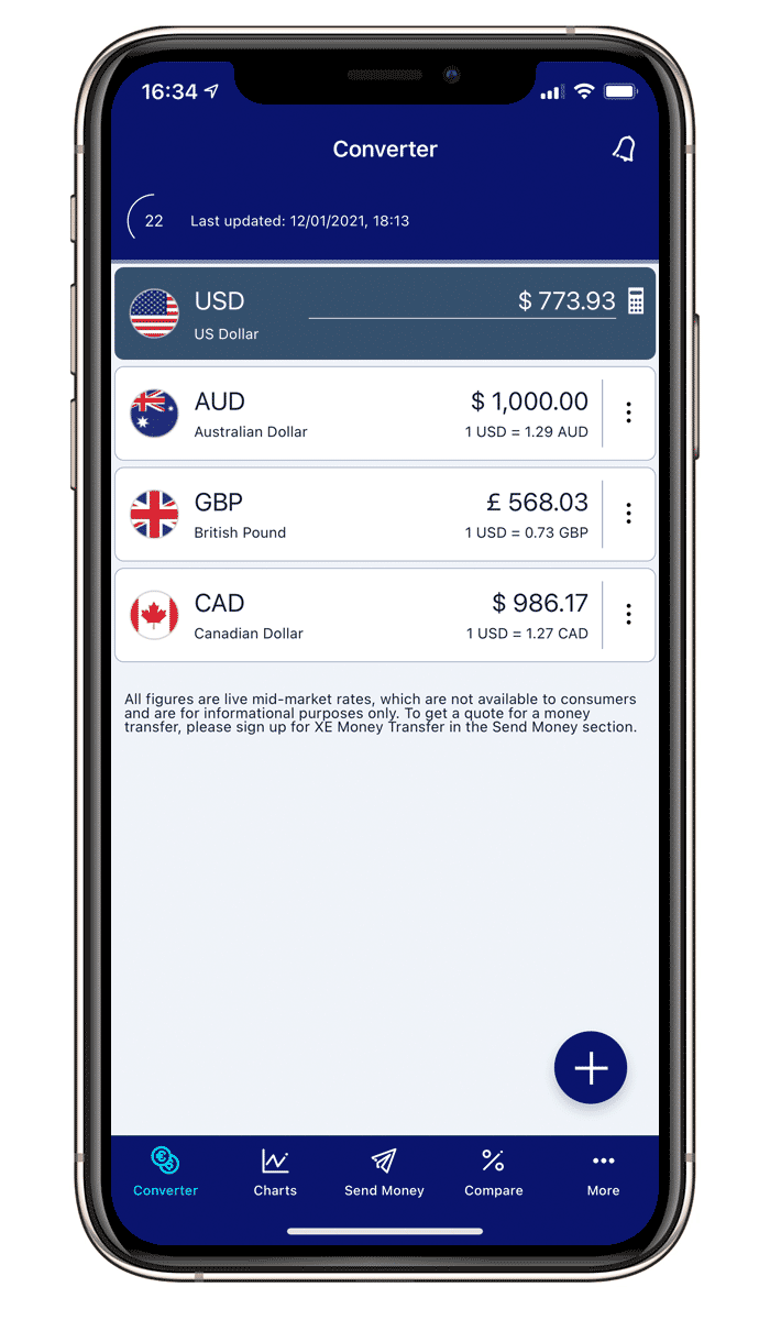
The Xe app has been installed over 80 million times by a dedicated user base.
However since the apps first release the landscape has changed and so has Xe's product offering.
So how did we go about introducing new features to our and aligning with the wider business goals?

Research, research, research
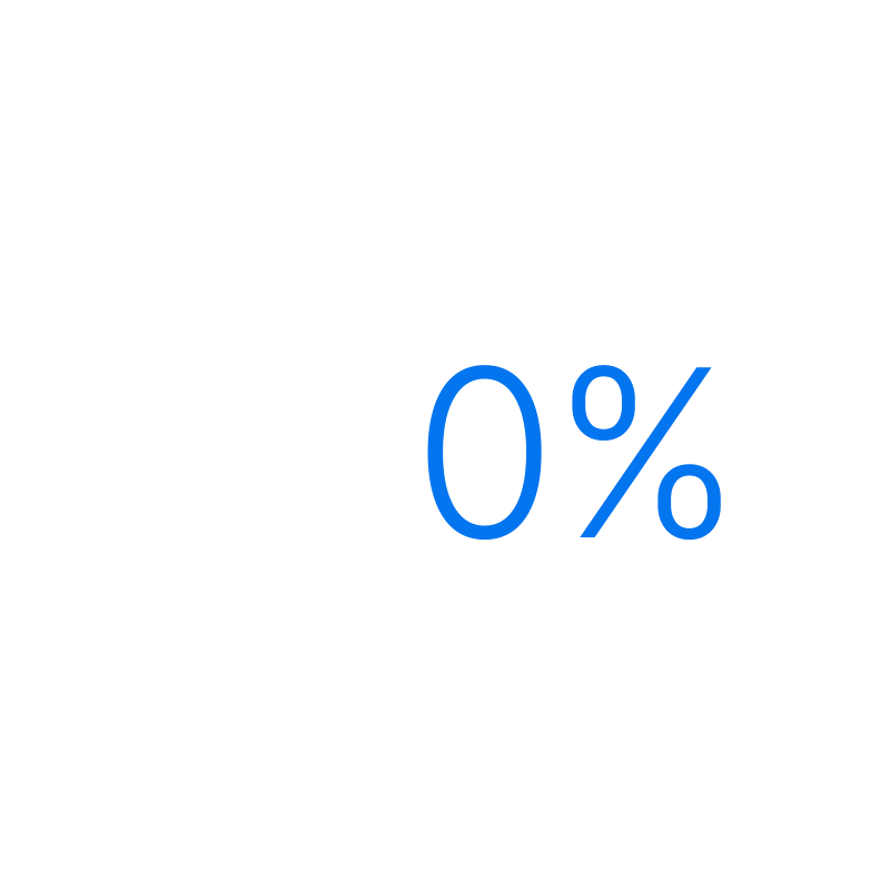
At the start of this journey we ran a large survey and, surprisingly, we discovered that 48% of users didn't know Xe offered a Send Money service.
It was essential to the business that we addressed this within the Xe App and Xe.com.

Let's workshop it
We organised a two day workshop and invited the executive and key stakeholders. It took place in our Toronto office where I contributed UX design ideas and opportunities. We discussed other technology innovations we could integrate from the companies within the group.
I then compiled all our ideas, and shared and presented them across Xe.
Figma
I really enjoy working with Figma, it's like the Swiss Army knife of software tools for designers. Everything is available to the team in one place – layout, edit, share, animate, prototype and developer handoff.
Concepts
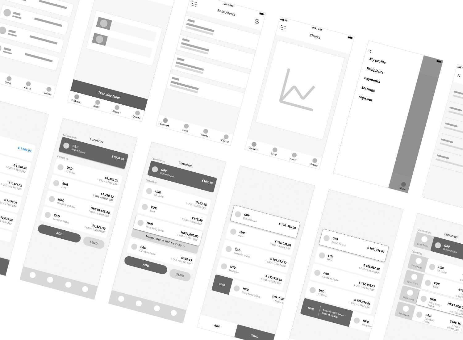
In the early stages, we created lo-fidelity wireframes using a monochrome colour scheme. This helps focus on functionality rather than styling. Once we agreed the right approach, I moved on to refining the designs.

Refinement
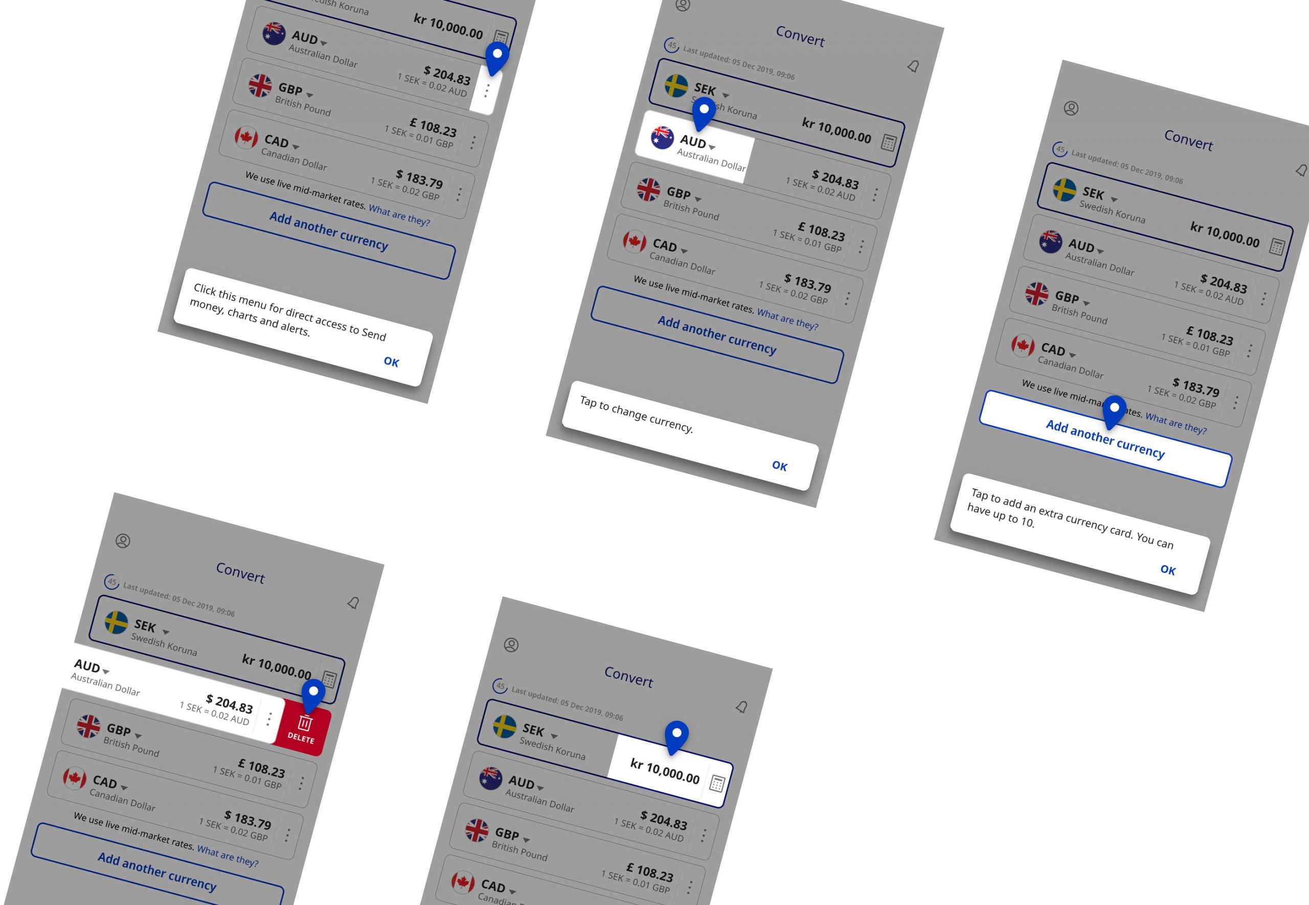
We considered many different options before settling on the final styling. Constant refinement is a key principle of UX and fundamental to the way I work. Here you can see higher fidelity comps based on the initial concepts above.
We also had a wider objective providing design efficiencies, helping speed up any future development and bringing teams across the globe together.

Components
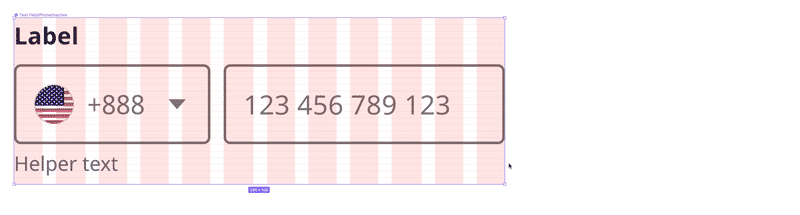
I built out a set of adaptive components in Figma. These were used by the design team to create the various flows and they were the basis for our design system.
Flows
All flows are mapped out in a master Figma file. Using Figma we worked collaboratively and shared flows with stakeholders. Handoff for the devs also worked directly from this file.
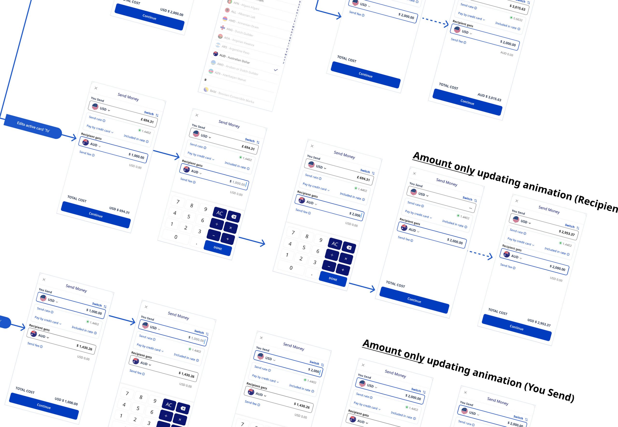
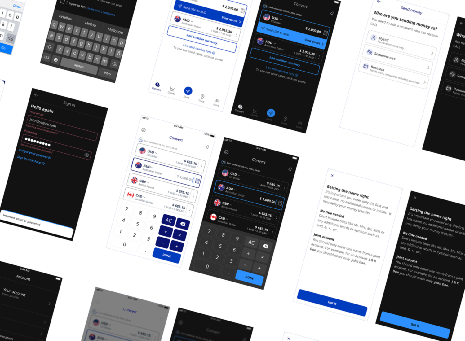
Prototype
I created prototypes to show the senior leadership team how the finished app would look. I used prototypes to illustrate how animations and interactions should look and act.

Animation
I use animation in select areas as a visual cue for an action which adds an extra layer of feedback for the user. It also brings delight to the design.
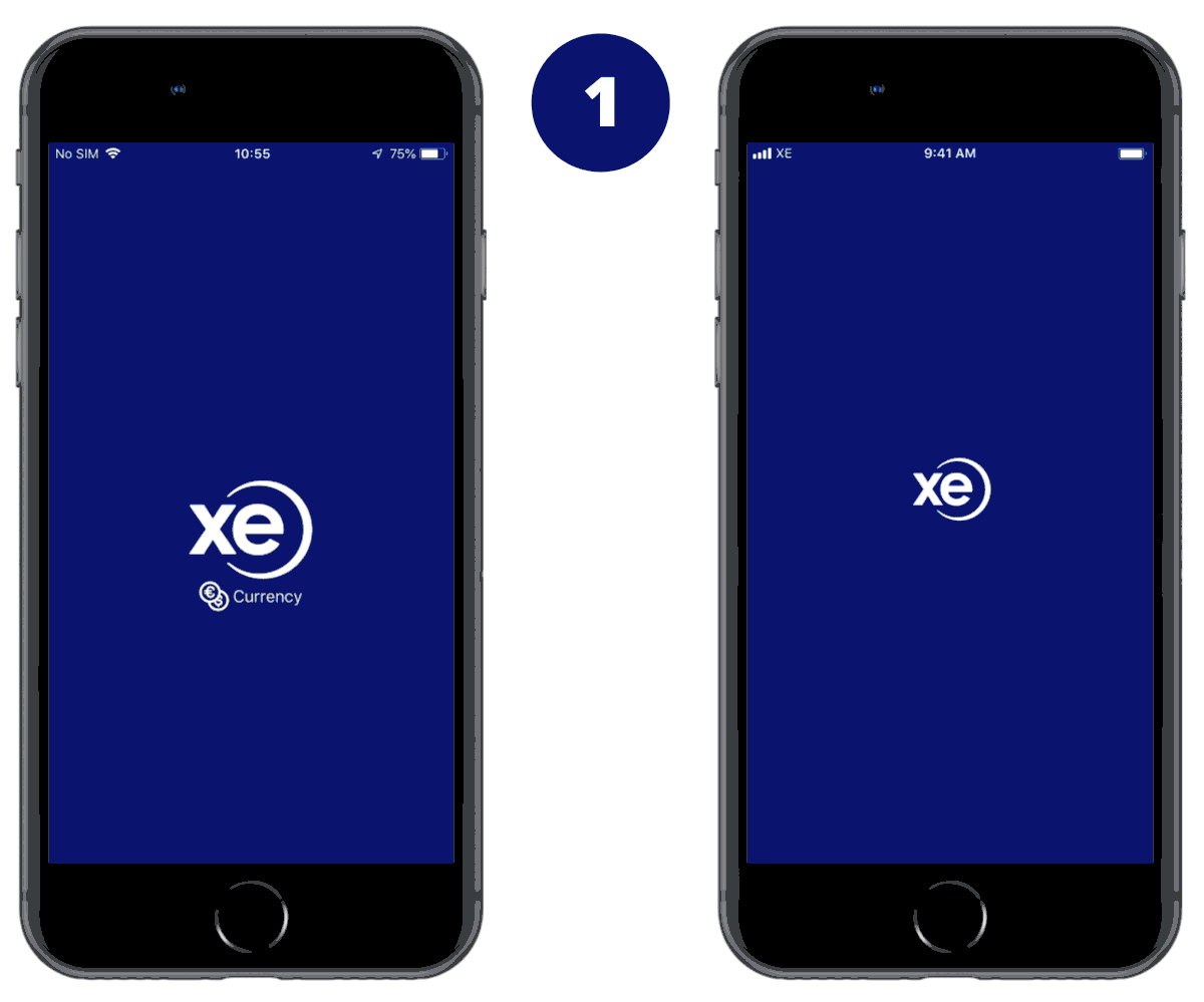
Onboarding
Any major changes to an existing product or UX/UI can be challenging for users to accept and get used to. For the roll out of the new Xe app I designed a simple tour to introduce all new features.
Feedback - Dark Mode
After the limited first release, we received feedback from users asking for a Dark Mode. I mapped the set of light colours to a dark palette, enabling the developers to easily swap colours for the two modes.

Content
Multi-language support for an app with 80 million installs worldwide is essential. Contentful is integrated as the localisation platform.
I made flexible componentry that could accommodate different lengths of text.
Reducing friction
Cutting down the number of steps was another focus.
Comparing the old version of the app (left) with the new app (right). The user is able to register and send money while the old app user is still setting up their payment method.
Send money - success!
Our design made a difference. Send money is now the business driver and key performance indicator, we had an increase in first trades of 92%.
Trust built
Our designs resulted in same day money transfer figures increasing by over 200%. Because our customers are more aware and confident in the service we offer.