
The challenge
The main site navigation was overly complicated and bloated. We ran tests to find out which products and tools users wanted and how to present the navigation in a streamlined way.
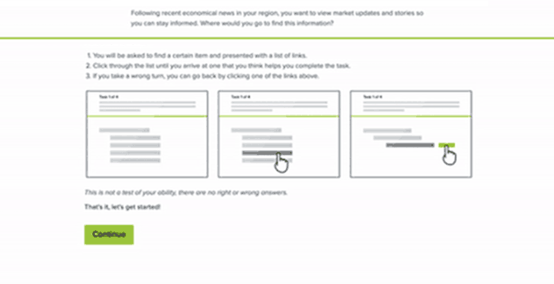
Research - Tree test
The test starts on user testing.com then redirects to Optimal Workshop. Users were presented with scenarios and tasks, this helps us to:
- Measure navigation decision directness
- Gauge the effectiveness of the current navigation
- Measure the success rate
- Measure time taken to find what users are looking for
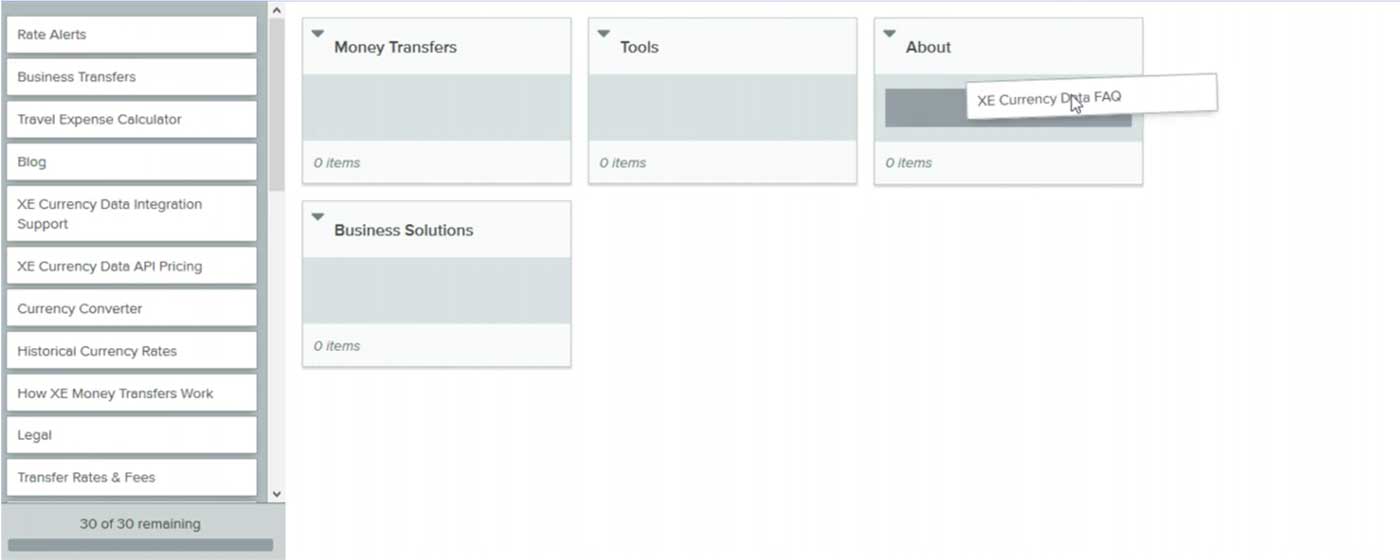
Research - card sorting
The follow up test asked users to group navigation items, this helped inform UX about the most common groupings:
- First session was an Open Card Sort
-
Users are presented with a series of items to sort
-
- Second Session was a Hybrid Card Sort
- Users are given the same cards and categories
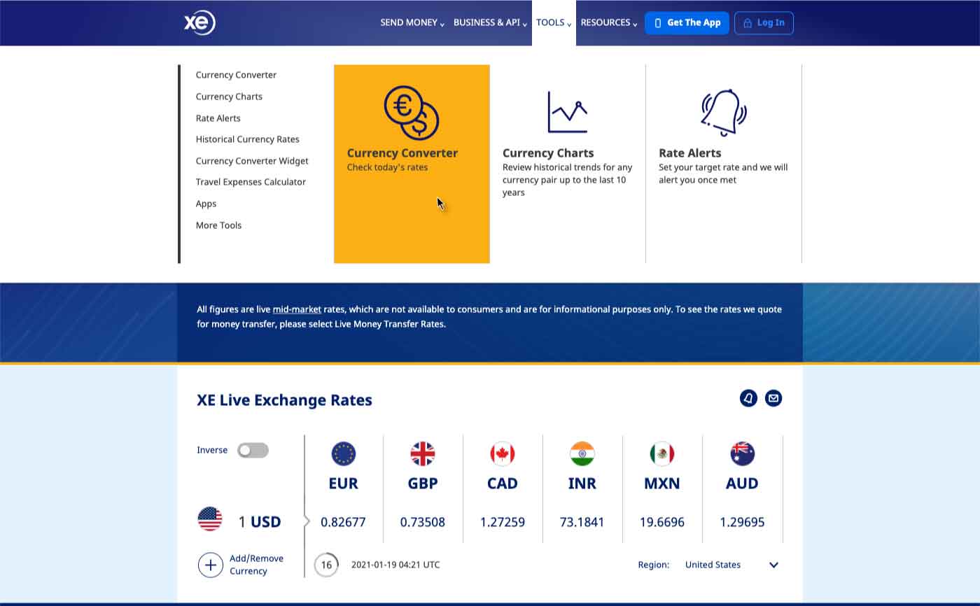
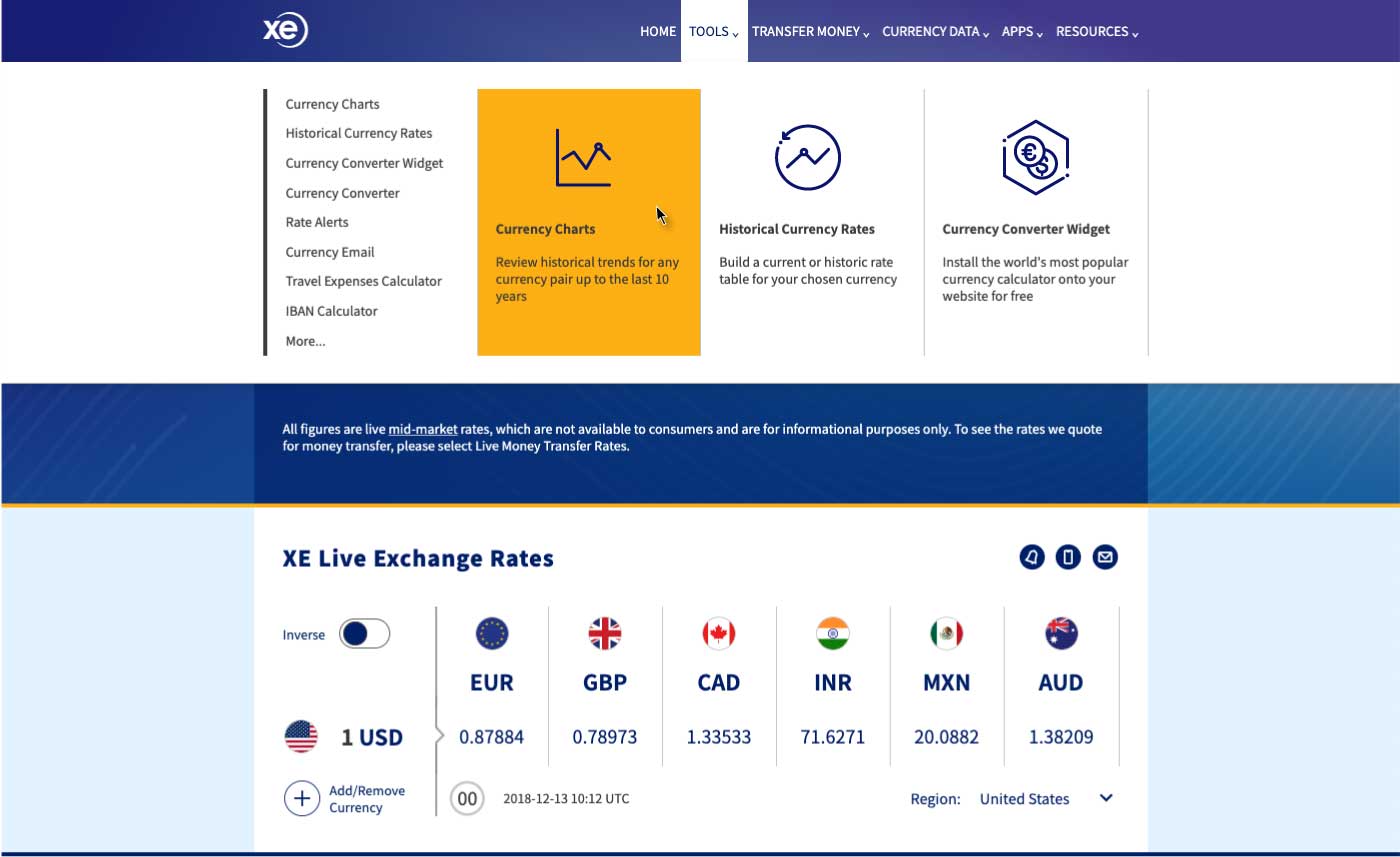
Implementation
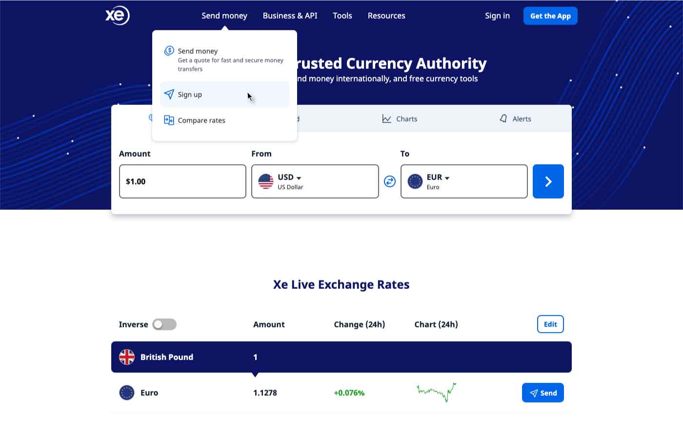
Once we had analysed the data, a cleaner approach emerged, 4 main categories. This also gave much more prominence to 'Send Money' which is the KPI for the business. Launching with the existing styling gave us a single point of measurement for the change.
- Send Money
- Business & API
- Tools
- Resources
Design overhaul
Once we were satisfied our users were happy with the change, we put new simplified designs in the backlog. The full width mega menu had way too much information and was confusing for users. A far more elegant and simple menu was introduced in the next sprint after phase one was released.

SEO
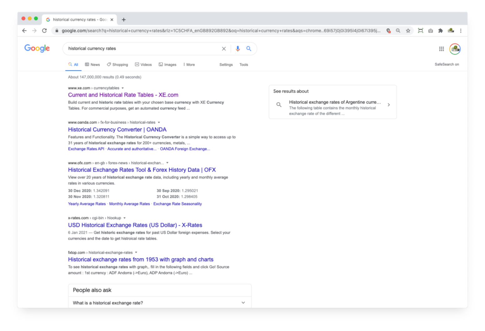
Xe.com/currencytables/ has an amazing google ranking, 1st position in the results for 'Historical currency rates', with monthly visits into the 100,000s. I was tasked with several refinements
- Study the data
- Introduce the new design language
- Leverage other Xe services
The data
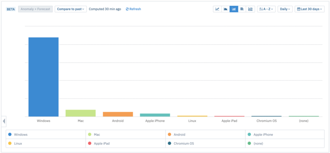
I used Amplitude to get insights from our users, historic currency data is historic rate data used by a certain subset of our users.
- 80.6% of monthly page views came from Windows desktop users
- 89% of the views were desktop - Windows and Mac
- 8% of users were on a mobile device
The challenge
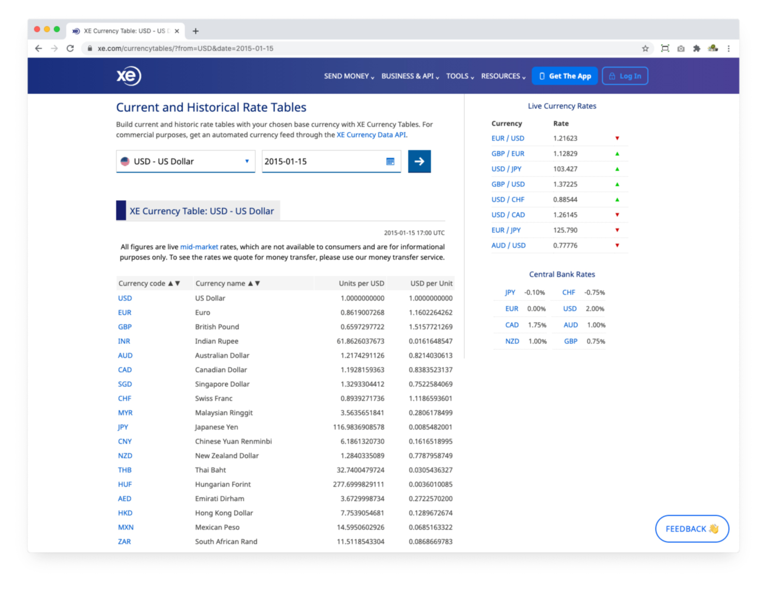
The output page is a basic table of data showing the rate against your selected currency for a certain day going right back to 1995.
I needed to target the users accessing this data to upgrade to Xe's Currency Data API product.
This is a great way to target exactly the right users.
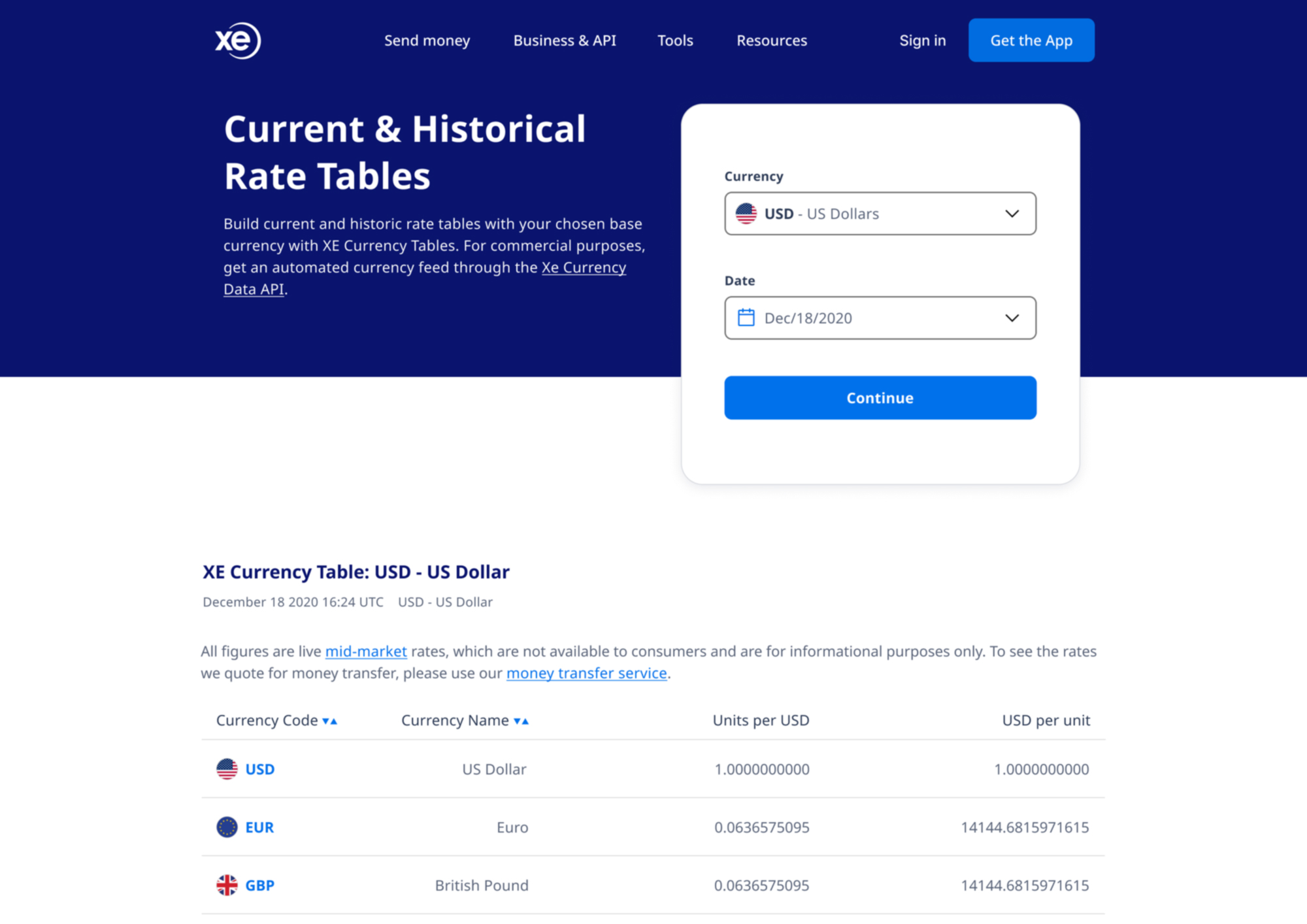
New design language
I applied the new branding and design language to the elements on the page.
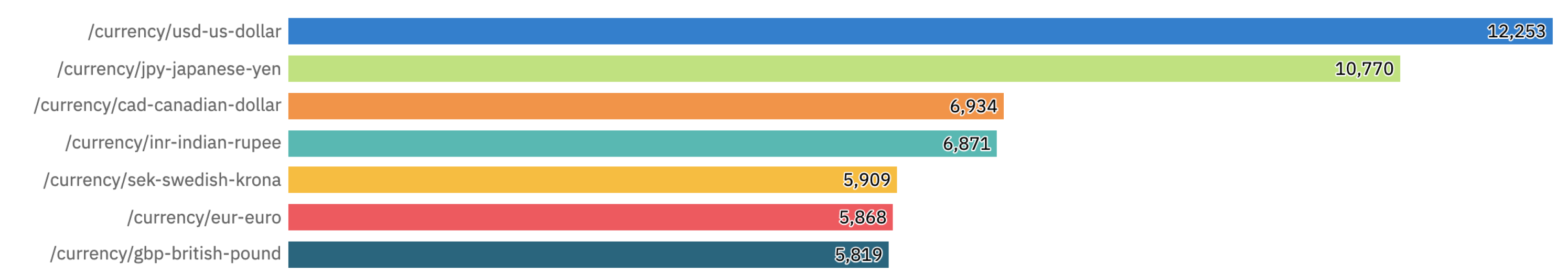
More data needed
I looked at the most popular currencies users were referencing.
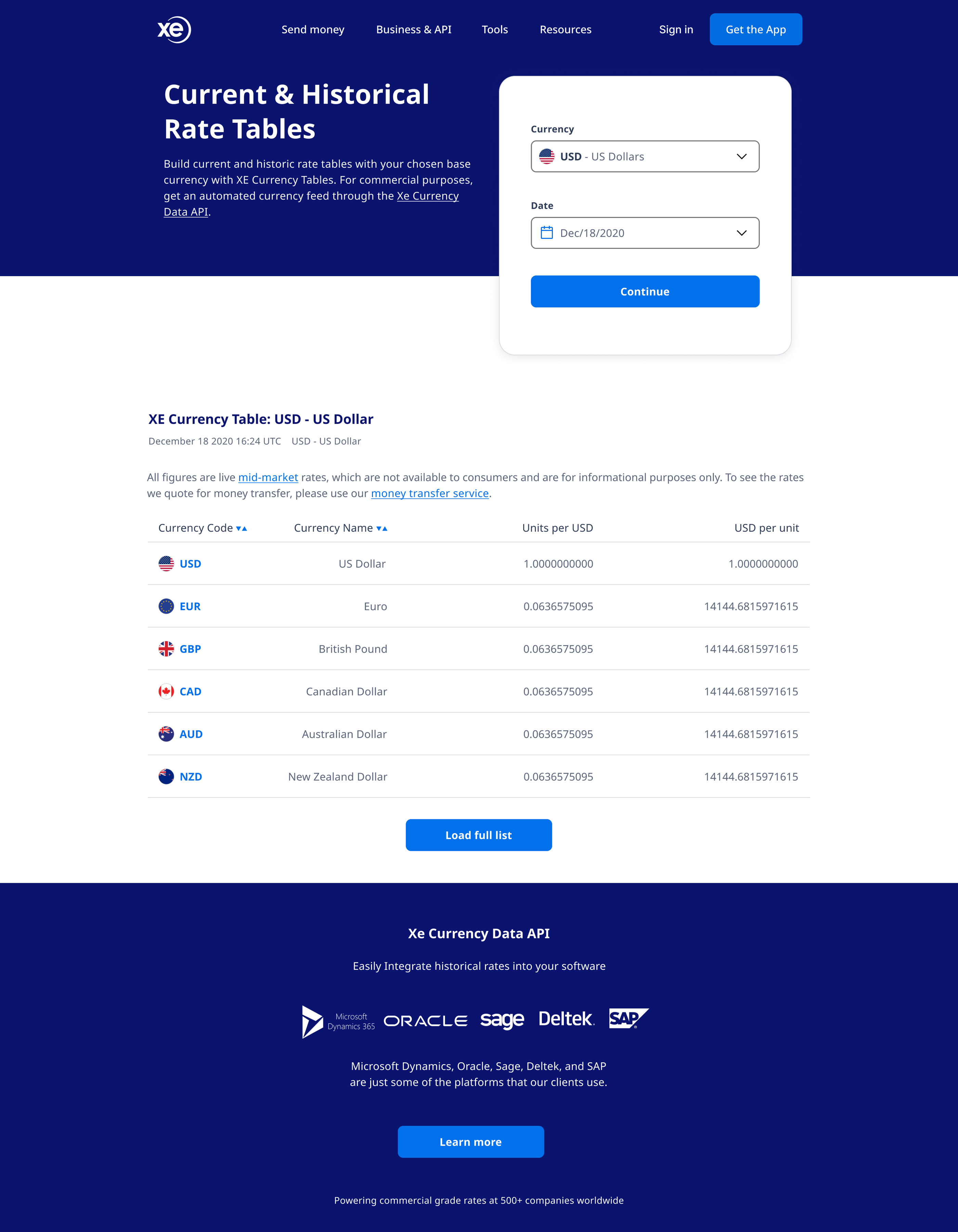
Solution
New design with logic from the analytics data
- Show results with a select list of most popular currencies
- This allows the API ad block to be seen by all users
- Achieves the business KPI of promoting the product
As with all my work this will be analysed, under continuous review and be refined and improved.